Compensation Tool Usability Evaluation

Context
As a major pillar in Accenture's workforce, Human Resources serves to compensate all employees that work with the company and generate revenue.
Recently, Accenture has announced that the company plans to abandon traditional performance achievement models and move towards a more personalized approach that prioritizes peer evaluations over one-dimensional data; the objective is to start viewing employees more as people, and less so as mere revenue streams.
In this project, I built out a usability and feasibility evaluation plan. This involved:
Conducting heuristic evaluations
Organizing user engagement plans
Synthesizing 10 hours of interview data
Creating design recommendations for stakeholders and development teams.
My role: research strategist, user tester, data analyst.
Timeline: 3 weeks
Considerations
Client teams had already invested lots of resources in design work. Importantly, there were already exhaustive lists of requirements that were driven through business meetings.
Designs had not been previously tested. Client teams were also unaware of usability testing best practices, requiring a debrief about general guidelines.
The visual design had reached a high level of fidelity. Full interactivity had not been implemented in the prototype used for testing, but we needed to consider how this might influence participants when gathering feedback through interviews.
Approach
Human resource staff have varying degrees of access to account for localized—and corporate—labor laws. We needed to gather input from folks within varying levels of seniority, since rank has influence over use case. Senior compensation managers might be working with a fixed pool of money, while senior directors have more pull within the organization to request funds. This impacts how people forecast!
The 12 people we interviewed were…
All HR professionals
In 6 geographies
Senior level (5+ years) to Director level (12+ years)
Process
The proposed system has two major pages in the interface: Model and Finalize. Each served different functions, so they were evaluated separately during interview sessions.
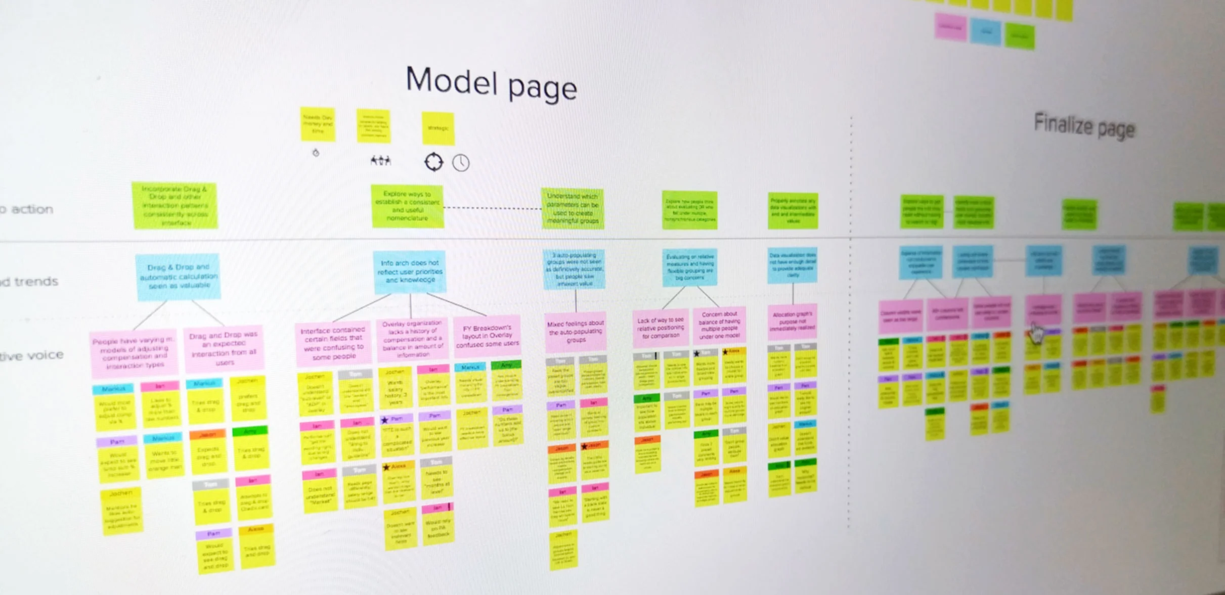
Discrete observations were clustered together, as done in an affinity diagram. To disambiguate my findings and create an actionable set of recommendations, I devised new labels for the otherwise traditional four stages of synthesis:
Observations. Direct and indirect quotes from participants, independent of analysis.
Collective voice. Distillation of what people were saying.
Themes and trends. When collective voices supported co-occurring ideas, they became more salient, high-level observations.
Call to action. Translation of recommendations from the most resounding themes and trends.
Outcomes
Since this was an evaluation, my deliverable was a report for the clients and development teams.
Client teams were given recommendations about overarching process and feasibility, in terms of user adoption. These were conveyed in terms of best practices and "voice of the user" -- direct quotes about the current state of the user experience.
Development teams received input about interaction patterns, user expectations, general user experience and usability requirements. These translated into design requirements for the agency's designers.